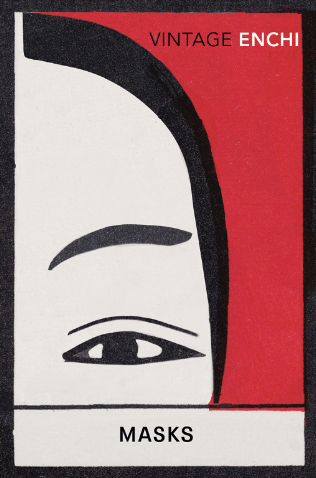
Literature's Visual Magpie: An Interview with Suzanne Dean

SK[Sherida Kuffour]
I’ve been thinking of calling this piece with you something along the lines of ‘Looking and Gathering’. From reading interviews you’ve done and from also personally experiencing your design work – which I truly enjoy by the way – I get this sense that you’re always gathering.
What I found immediately striking about your work is how each book cover manages to reflect the tone of its content. Each publication, with the use of colour, typography, and printing processes is truer to the book’s narrative rather than a particular style guide.
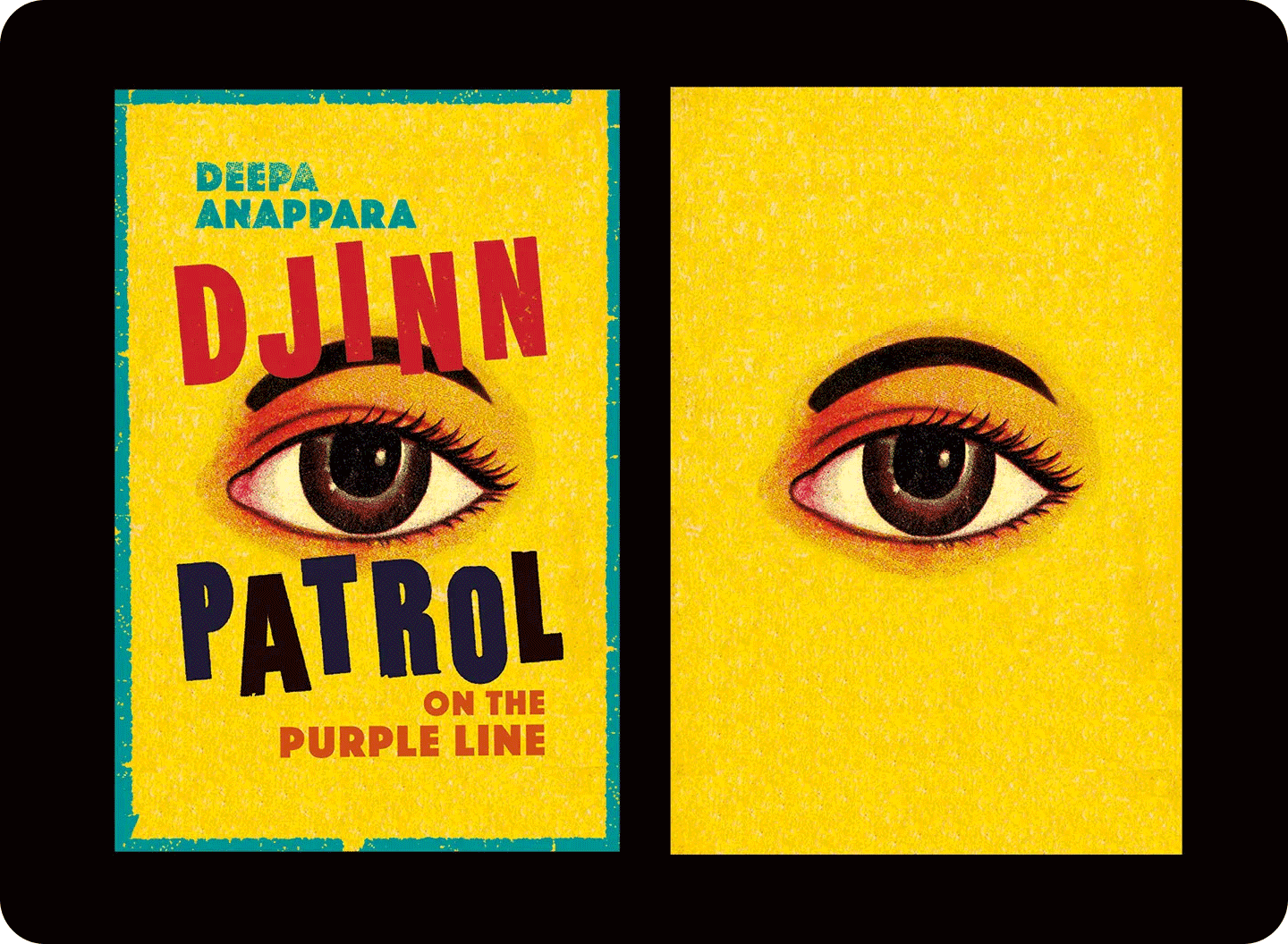
From the vivid cover of Deepa Anappara’s Djinn Patrol on the Purple Line (2020, Random House) 1 to the iconic Vintage Kafka series, 2 you work with so many different visual styles. Most designers, myself included, stick with one or two styles at most, whether it’s illustrative, typographic, collaged, or photographic. I imagine that the variation in these book covers means that the driving forces and inspiration behind them must also be as varied.
SD [Suzanne Dean]
I do feel like I'm a magpie. You know, I’m constantly going, “Oh, look at that, and that! and also that!” It's quite important for me to be looking into almost everything.
SK Adopting that way of collecting, as you say, of being a magpie, is important in graphic design. What are some unusual things that you’ve collected? I remember reading that the last book you designed was inspired by Indian matchsticks. 3
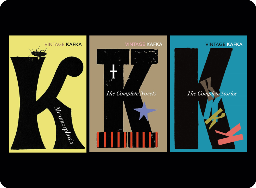
Kafka book covers
SD Obviously, the input equals output. When I get a brief, I always read the book; I think that’s essential. I know it seems pretty obvious, but some designers don’t read the books at all. In my process I’m always looking for the absolute essence of the book to guide where I look for inspiration. So whatever has been inspiring me or whatever I’ve collected or I’ve seen finds its way into what I’m doing.
I have a team of about 10 people working with me and we go out on trips to find and gather said inspiration. We take turns going somewhere. Right now, I've got three people from my team trying to organise a surprise trip for us all. I’m also, for example, organising a trip to a printer who specialises in incredible different techniques of printing, which I think will definitely impact what we’ll produce at some point.
Then I do have a sketchbook that I carry around, make notes in, and sketch in. I'm constantly thinking about the projects I’m working on; I can never escape from it. There’s always some job going through my mind.
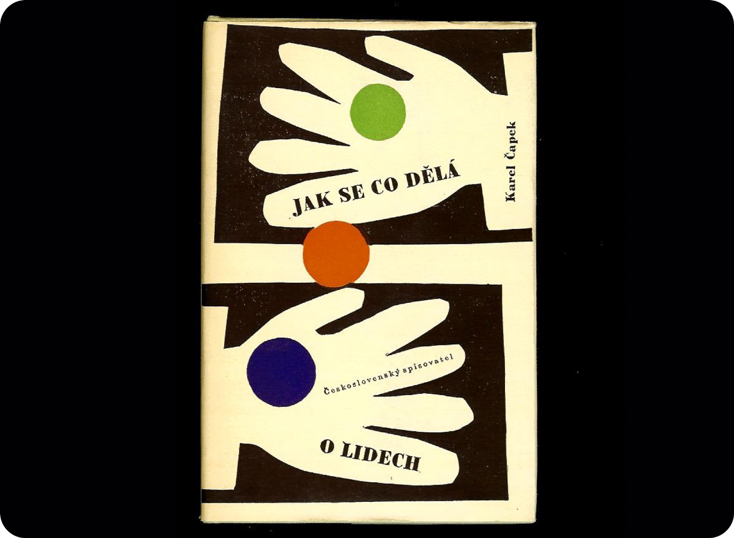
But apart from that, the mobile phone is the most wonderful thing we carry in our pockets, and just going into bookshops when you’re traveling: I love that. That’s one of my collections. I brought this to show you. This was from Prague, I bought several books there. The book shops are so good there.
This is the book from Prague that Suzanne was referring to.
What else do I collect? Well, matchbox labels, obviously. That was picked up and used in the Djinn book. Everyone I know collects matchbox labels because it’s very easy and they’re very cheap, but they are gorgeous. They’re just like mini book covers.
So these things are, of course, for a book-cover designer absolutely a gift and a source of inspiration.
But it's interesting because I go through these sorts of ‘binges’, where I order quite a lot of these matchstick boxes. They come in the post and I stick them into my little folders, and then I’ll move on, and I forget, and then suddenly, there’ll be some something like the Djinn cover and I think, “Oh, yeah, the eye thing that I saw on that matchbox label I collected.” It’s cyclic.
I used to have a massive collection of toothpaste tubes. My job when I graduated from studying design was working in packaging. That was my first graphic design collection, if I think back now. I’d been in a shop in Slovenia, I think it was, and there was this beautiful tube of toothpaste, and it had a red circle and a gold circle on it and it was perfectly white. So I bought it and that started a collection.
I grew a large collection of them because people started to bring them back to me when they travelled. So in the end, I had this huge collection of toothpaste from all around the world that took over a wall in our house. It was a bit overwhelming in the end, so I sold off most of it.
"I was told often that I was being a bit too creative, so I jumped at the chance at moving to publishing when a job came up"
What else do I collect? Old type books.This came from the art director at Knopf, Carol Carson, who had seen that while I was in Vancouver, I’d gone into this old bookshop and picked up a similar book to this and shared a photograph of it on Instagram saying, “Oh, I wish I could fit this in my suitcase.” When she retired from Knopf, after being there for many, many years, she sent me this in the post as a gift. I just thought, “No way, this is the most gorgeous thing.”
So it’s been precious to me. I also collect letters and globes, as well as books that I love that other people have designed that are inspirational. I collect lots and lots of things. I mean, it’s endless – that’s a graphic designer for you.
The type book from Knopf's former art director Carol Carson.
SK I wish I was that good at collecting things, but I don’t have the patience to wait until a collection of things is big enough to justify taking up space in a drawer or box, so I just find that random things end up cluttering my house. But now that I think about it, I guess this could be considered a collection: I love rum, and I collect their bottles.
SD Alcohol packaging is definitely always interesting!
SK You mentioned starting your design practice as a packaging designer. How did that work translate into the work you do now in book design?
SD Well, I was in packaging for around 18 months – that was all – and I found it very constraining. I was told often that I was being a bit too creative, so I jumped at the chance at moving to publishing when a job came up. When I started there, I didn’t know anything apart from the basics. I wandered into book shops when I got the job and was looking around, but I was naive. I didn’t know what the rules were. I didn’t exactly start at a junior level; I was literally dropped into it and I just had to go for it. My naivety meant that I suggested things that people wouldn’t normally suggest.
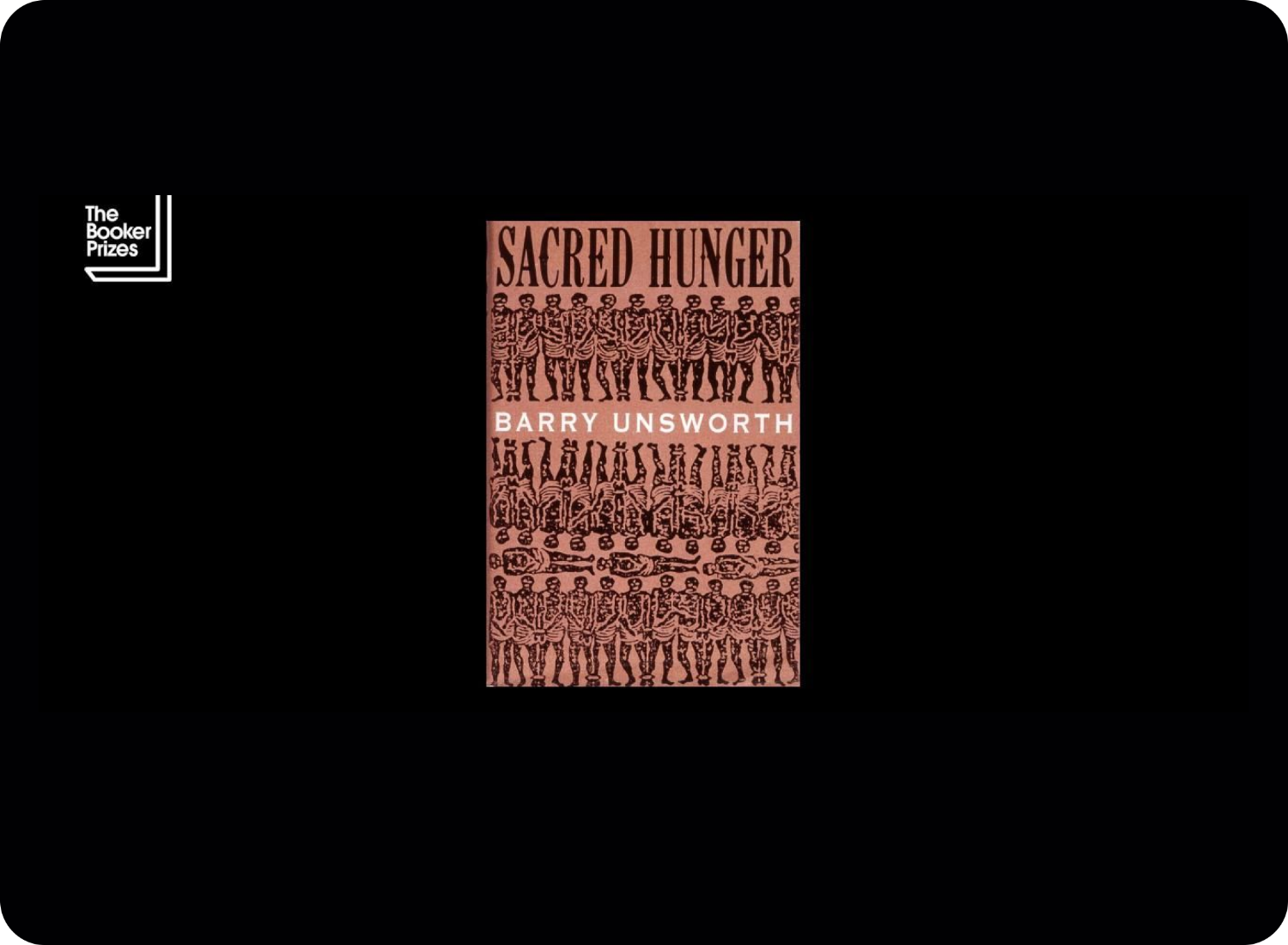
So there was a book cover needed for Barry Unsworth’s Sacred Hunger (1992, Hamish Hamilton), 4 which eventually won the Booker Prize. And I can remember, people were struggling with it, so I was asked to work on it. I got some brown paper and I put it through the photocopier, then I asked production whether we could print black foil on this type of brown paper. It was the first time that they’d ever had to work out how to do it. I was asking to do a colour print on a metallic background with silver foil on top; nobody had done that before. These were things that for me were just about suggesting slightly weird options. I was just saying, “Can we do this?” And I think most people were just putting lettering in a panel on a background, so I was kind of pushing boundaries.
Even now, I go to production and they go, “Here comes Suzanne.” I’m still trying to push boundaries, still trying to think of alternative ways of doing things, but I think it makes it more interesting for everyone, myself included. Maybe that is a something to do with me being naive, but it’s also my nature ask, “How can I do this differently?” And so I’m still causing issues in production.
SK Are you still putting random objects through the scanner, Suzanne?
SD Yes, absolutely!
SK I want to come back to your work as creative director at Vintage Books and ask you what gathering inspiration for your team looks like. 5 What are you and your team up to at the moment?
SD Well, I recently took the whole team to a letterpress day where we did old-fashioned letterpress setting to just sort of see what it felt like. But that led to the Vintage Kafka series. That was the link, how that started. The big wooden letters became the starting place for that series. So, you know, that’s an example of where collecting, specifically collecting together, became the design.
"It often happens that someone points out something that I wouldn’t consider looking at in a particular way."
SK I'm beaming because I’m imagining how amazing it must be to be a part of your team, to have days out. I’ve worked in design for a long time and these excursions are not a given in our industry. I think that’s very special.
SD Yeah, it’s definitely very good for bonding as a team as well. Of course, we don’t get to go all the time or all at once, but we take turns in organising different things and it truly is wonderful what different people add to the collecting process.
SK Exactly because people with their own contexts and job positions can gather vastly different things.
SD Yes, that’s true. It often happens that someone points out something that I wouldn’t consider looking at in a particular way.
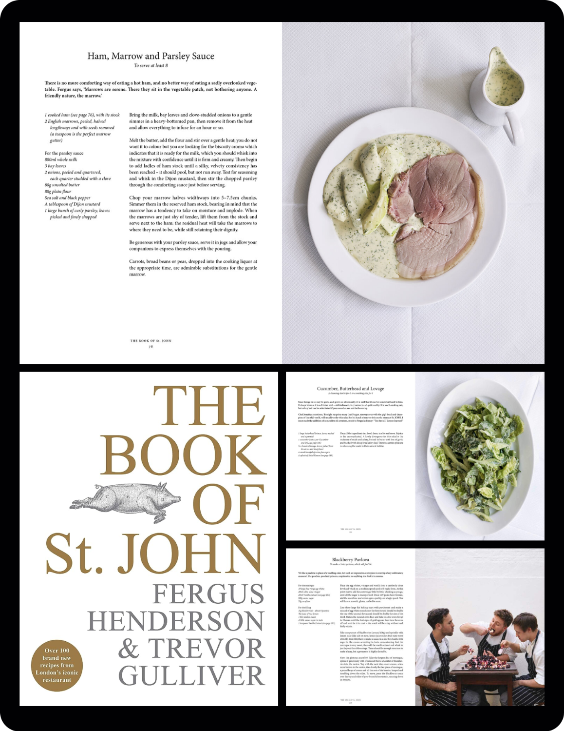
SK For this next part, I want to ask what three of your favourite books on your bookshelves are and why? I’ll start with two of mine. The first is a cookbook by Fergus Henderson and Trevor Gulliver called The Book of St. John (2019, Ebury Press). 6 It’s designed by Will Webb and as publications go, it’s not especially impressive, it's einfach. A plain white, slightly grained cover with gold-foiled text and an illustration of a dead pig by Jason Lowe.
Inside the book, its pages are intercepted by images of lobster sandwiches and braised cuttlefish, photographed impeccably by Henderson – by all accounts it’s your standard cookbook. Still, I love this book because its design brings up a memory of when I first started eating, let’s say, ‘uncooked’ food. The book mimics what most struck me about the restaurant: a sense of honesty.
This is the St. John cookbook that Sherida was referring to as one of her favourite publications.
The second book, or rather booklet, is called An Energy State Nobody Quite Expected (2017, Lenoirschuring). 7 It is sentimental to me. It was written by Marijke Cobbenhagen and Dimitri Nieuwenhuizen, one of my teachers at Sandberg Instituut, Amsterdam. On the back of the book, both writers refer to it as anything from a transcript to a manifesto to a performative lecture.
Nieuwenhuizen was a visual philosopher who passed away in 2017 during my studies. Though I did not know him for very long, I cherish this publication as one of his last pieces of work. But more than that, this booklet taught me how simple book-making and writing could be.
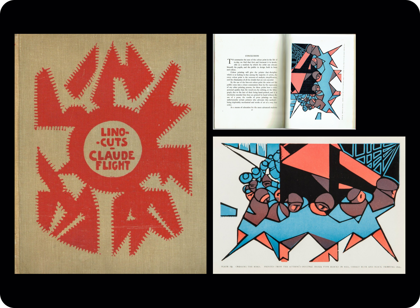
SD So, I've got a sentimental book first, it’s a very old book. It's called Lino-Cuts: A Hand-Book of Linoleum-Cut Colour Printing (1927, The Bodley Head Limited) by Claude Flight, and this was gifted to me by Julian Barnes. 8 suppose he bought it as a, you know, ‘we’ve worked together for a long time’ kind of gift. He knew I was interested in linocuts, and so he gave me this gorgeous book by Flight, who was one of the cutting edge artists working with linocuts, and so that’s really, really, really precious to me.
Claude Flight's Linocuts book.
And secondly, is this. So, this is I Read, We Meet (2018, Rye Field Publications) by Wang Zhi-Hong, 9 and it’s just one of the books that I bought when I visited Taiwan a few years ago. This aesthetic is just gorgeous. It folds out beautifully, and there’s even some lovely brown paper in there.
He’s such a good book designer. I asked to meet him and interview him for myself – I just wanted to meet him when I was in Taiwan – and he allowed me to come and visit him. It was the most amazing thing because I had to organise bringing a translator and the person who ended up doing it was a graphic designer who was as excited as I was to meet him. Just lovely, very precious
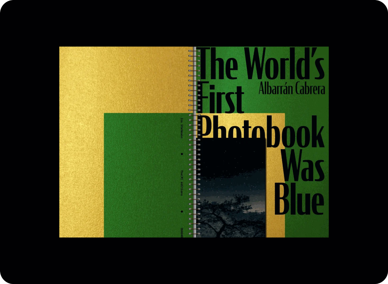
The next one is this, The World's First Photobook was Blue (2021, the(M) éditions) by Angel Albarrán and Anna Cabrera, 10 who are amazing photographers that I met when I was in Barcelona. And when I saw this last week it was the last one left on display, and it is the most amazing book. As a photographic duo they are inspirational. I probably spent too much money buying this book, but I couldn’t resist it. I will treasure it always. And it's a signed copy! I think that one day they’re going to be massive.
SK I have to say that ring bound books are some of my favourites, especially when they play with different paper sizes on the inside. Do you have a binding technique that you love the most or any other kind of book construction technique that you enjoy?
SD Well, I think you’re always bound by money. And at the moment, I'm doing quite a bit of quarter binding, which is done with cloth, which is really unusual. So we’re designing a new series of classics for Vintage and we’re being allowed to use cloth as our quarter binding and just a sort of sealed paper stock for the boards. So that’s my big thing at the moment. That’s in progress.
SK Is that typically expensive to produce?
SD It is more expensive, yes, especially in cloth. But because it’s for a classic hardback series it kind of makes sense, because it’s sort of giftable. And you want something that is going to be able to last on people’s shelves.
"You think that you perhaps have a bit of freedom, but actually, after a while, you realise that there are more constraints – money being one of those constraints as well"
SK And so when you create books, are there any particular format constraints relevant to the publisher? I assume you can’t just come with whatever paper size you want since it’s all hinged on the market of the genre you’re in.
SD So there’s the demi, the royal, the B size, and very frequently there’s also the smallest, A size. And at one point we were doing this cut-down and shorter format, which was wider and shorter. Basically, it was shorter than the normal B format, so it didn’t sit completely the same size as all the other B-size books in the shop – and most bookshops stock B format books.
But bookshops didn't like the smaller size that much and they asked us to stop doing it because it didn’t fit on the tables. So, well, it’s also about knowing that there are reasons why bookshops have certain size tables that fit certain books, and, you know, it’s a shame that this smaller size is going to disappear now, because it was a nice series.
You think that you perhaps have a bit of freedom, but actually, after a while, you realise that there are more constraints – money being one of those constraints as well. So, for instance, these, which I love, have flaps. And they just have patterns for the endpapers, which is lovely, but that puts a lot more on the price. Although I’ve always felt that those are more collectible. I mean, the series won a prize for a classic reissue series, and I think they’re just the most gorgeous thing. They're really, really, really beautiful.
"We have to be really careful about costs and we have to be able to justify why we do what we do"
SK The financial constraints are one of the, if not the biggest blockers in publishing. I was speaking to a publisher last week who is having a hard time at the moment financing paper, which has risen exponentially in price as a result of Russia's invasion of Ukraine. They need to pay around 30CHF per book whilst their sale price ranges from 28 to 40CHF.
SD Yeah, I mean, that’s detrimental, I can’t even imagine it. We have to be really careful about costs and we have to be able to justify why we do what we do. If we're doing something like the cloth for those quarter bindings, then there has to be a really good reason, and it has to work financially. It’s not just about aesthetics, and as you said, paper is really expensive.
There’s so much to consider also with environmental issues that we now take on board, much more than when I started in publishing. We’re trying to avoid using lots of foils, lots of gloss varnish, you know, all the stuff that makes it harder to recycle. I've started to not use so much sort of matte laminate, and think of how to do things much more environmentally friendly, like just having cartridge paper with a pantone which is equally as nice.
SK This is also a lesson, and a reminder for me, about getting to the essence of things when designing. By showing me all these publications that are so rich and vibrant and that also do a good job of communicating the topic, I see that they don’t do the job less just because they have certain constraints. To work within certain confines like paper limitations and printing requirements in book-making can be a highly effective way to think outside the box.
SD Exactly, and when you’ve got a piece of artwork and a cover that works and does the job really, really well, you don’t always need fancy finishes because the simplest things can, as you say, communicate the essence really well and that’s when the magic happens.
SK In talking about all these sort of technical aspects of making a book, it reminds me of how I think book-making is often romanticised. I’m realising that you can do a lot with a lot less. I’m thinking back when I was in uni’, and I’d scan things, print them, scan them again, and print them again to arrive at some idea of a book cover. It was fun, and It didn’t cost much.
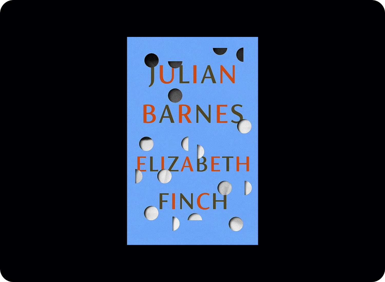
SD It definitely is romanticised, but I also do enjoy and love what I do, so it will always have that element of romance, you know? But, of course, there has to be a reason why you do something. There has to be a reason for why and how you’ve chosen to respond to a brief in a way that communicates the essence of the manuscript. There has to be a reason why you’d want foil or a die cut. Here’s an example of something that I felt needed a special production technique, Elizabeth Finch (2022, Jonathan Cape) by Julian Barnes. 11
SK Oh yes! I love this book cover, it's so striking!
SD This was a really tough brief. I’d gone through loads and loads of ideas, and this was the only one where I thought the die-cut technique worked really well – because the book was about biography and discovering what the character was really like. It was a lot about revelation and I wanted the book cover to have something that you opened to reveal a full picture or portrait.
To be honest with you, I was so lucky. I feel like I got away with producing this! You know, that’s an extra cost – the die cut – but it was worth it because I loved the end product. It was so beautiful. I was really pleased with what production did with that. It was just great.
SK That book really is gorgeous, and I’ve had it as inspiration on my Pinterest for a while! Speaking of costs, how do you judge or justify something’s production costs? For example, do authors with a track record of selling books get a higher production budget compared to newcomers where you don’t know if the book will sell well?
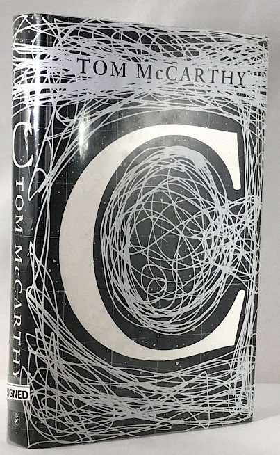
SD If you've got somebody who’s going to sell a lot of copies, for instance, like the Ian McEwan book I designed, Nutshell (2016, Jonathan Cape), 12 you would anticipate that the print run would be bigger, so therefore, you’ve got to balance off what you might do production-value wise against the number of copies that you might sell. Or, for instance, I did this ages and ages ago, I don't know if you'd know about this one, Tom McCarthy’s C (2011, Vintage). 13 It was his first novel, and I love the fact that it was just called C.
The book was amazing and full of ideas, so I suggested this idea of having a piece of acetate so that the actual hardback just had that graphic element without the author.
So when this went out into the bookshops, I personally didn’t see it, but I was told that there were tweets urging others to go and get the book because it was only going to be there for the first edition. It was a situation where people didn’t know what the book was like yet but were spurred on to buy it because of the packaging. In the end we kept this acetate idea going for around five print runs. It was really complicated and very expensive, but we continued because it became collectible and helped raise the profile of the book too.
It later on appeared on to the shortlist for the Booker Prize. So this expensive book production ended up being quite worth it and it was the author’s first book so we didn’t know how it’d do financially.
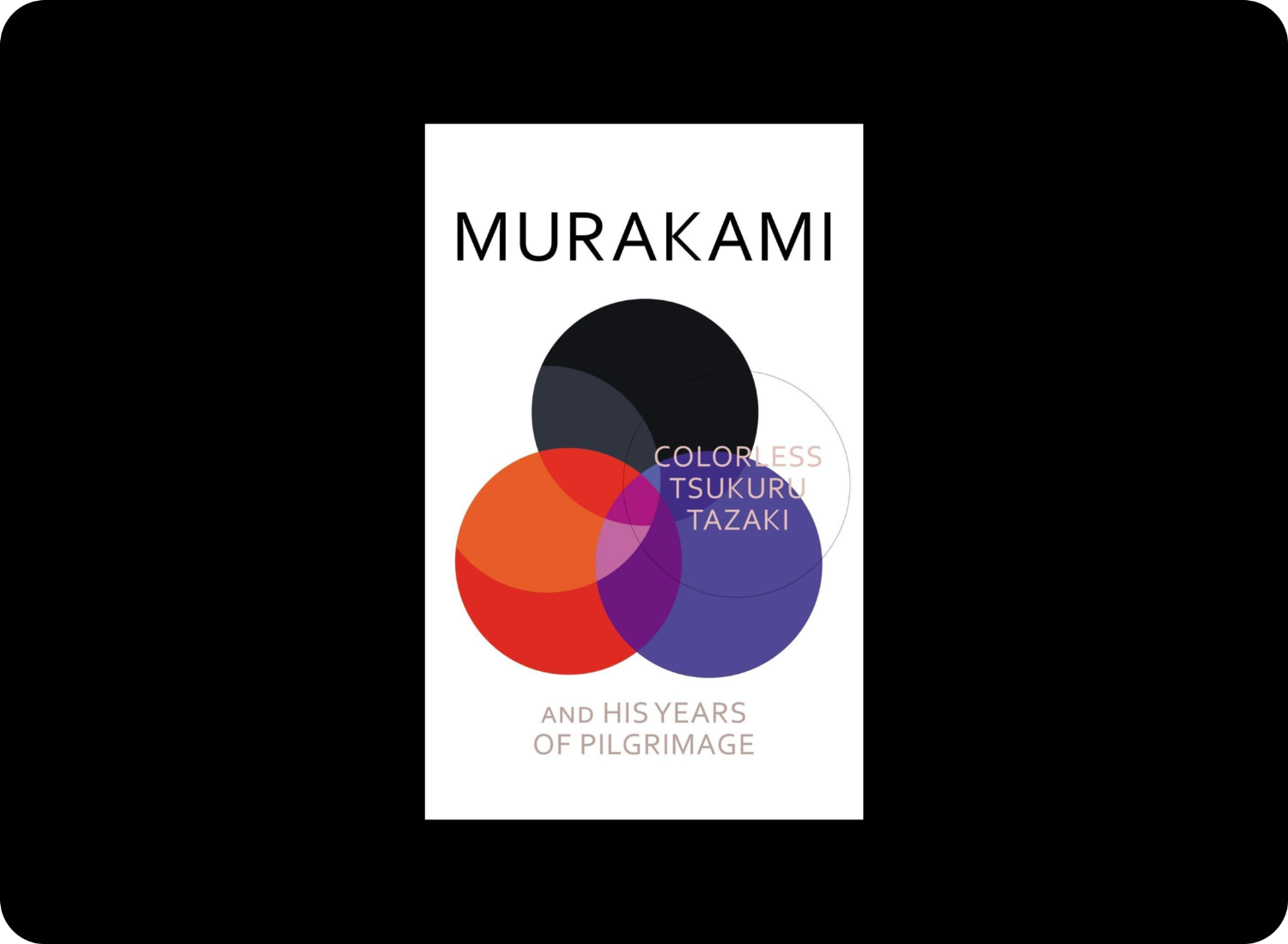
In comparison, for instance, Haruki Murakami, who’s very well known always has very simple book printing techniques and illustrations. In this case, for Colorless Tsukuru Tazaki and His Years of Pilgrimage (2014, Harvill Secker), 14 I commissioned five different Japanese illustrators to create stickers related to the different characters in the book. And in the end when they were all together, you could customise your cover with the different stickers.
That was special. Of course, I could do that because it was Murakami, so it was a whole concept and a whole thing behind the book and the marketing and the publicity, and of course he’s so such a well-known author, so that’s a different kind of scenario, isn’t it?
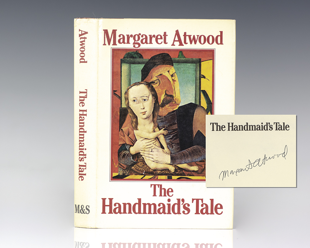
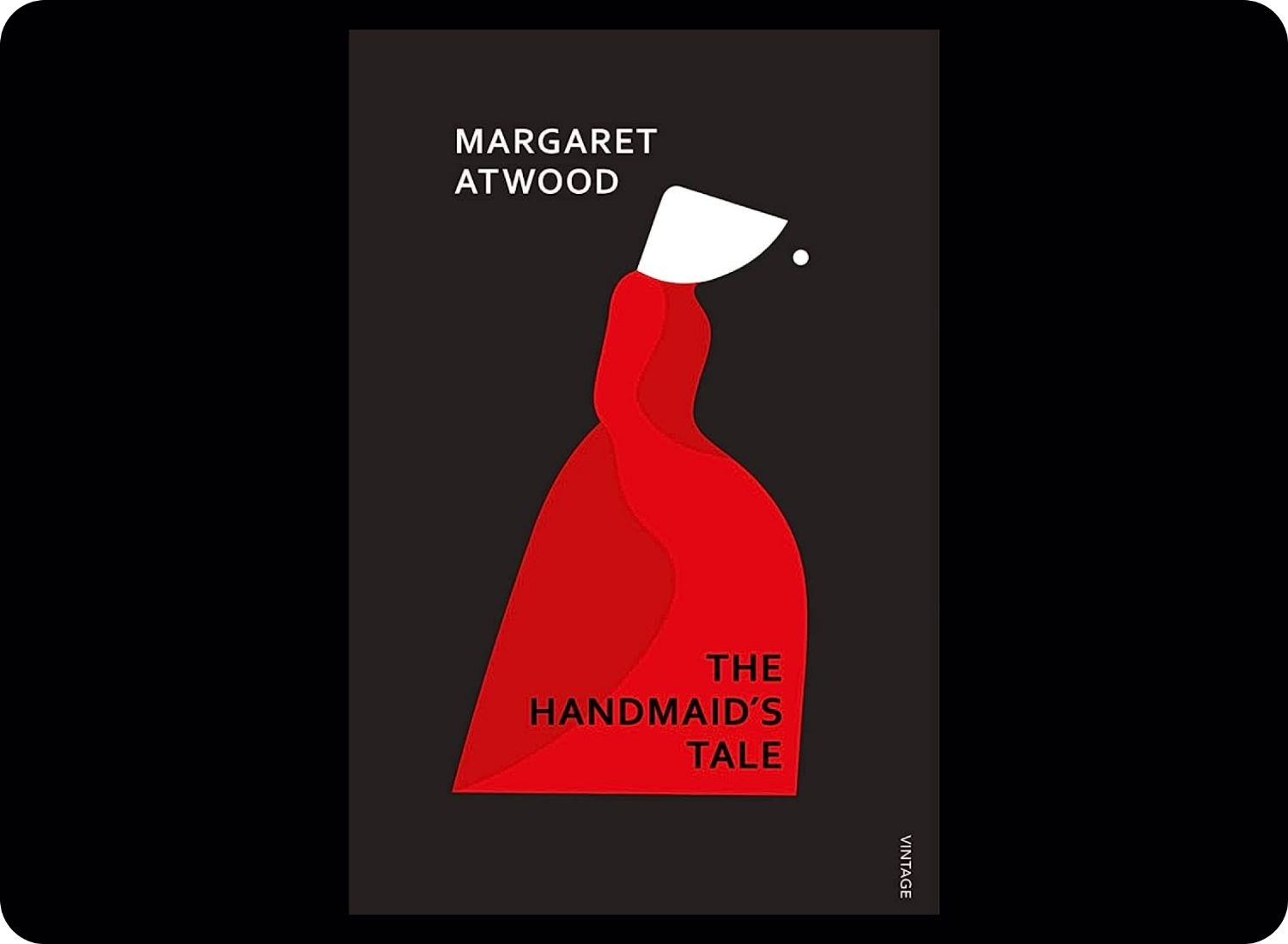
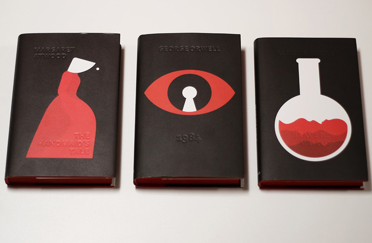
SK It's amazing that you brought up Murakami, because actually I was going to talk about the iconography of book covers. I mean his book covers are so well branded and known. It makes me think of Margaret Atwood’s science fiction book covers, specifically The Handmaid’s Tale (2018, Vintage), 15 which you designed and commissioned, right? This book cover you designed created quite the trend didn't it?
SD Yes, I suppose it did have quite a bit of influence.
SK I remember a lot of books after The Handmaid’s Tale having a similar minimalist design with geometric sans typography, bold colours, and just a general modernist and iconographic edge to them. Do things work in such trend cycles in the publishing world, where one book sets off a whole aesthetic approach?
SD The cover got sort of mixed up with a slight trend that was going that direction: modernist and iconographic.
I also commissioned Noma Bar, who did the illustration for The Handmaid’s Tale, to do Atwood’s The Testaments (2019, Chatto & Windus), and after that I noticed that other publishers were starting to do covers for other books in her catalogue elsewhere that were a bit like The Handmaid’s Tale.
Eventually we came around to our own back-catalogue of Atwood’s works, which we’ve now done with illustrations by Bar. There’s definitely a real brand and look which has come about because of our 2018 edition.
SK Some of the previous covers for The Handmaid’s Tale had been quite ornamental, such as the version designed by Tad Aronowicz for the book’s first edition in 1984, which has a quite pictorial collage by Gail Geltner.
I enjoy how dark and anonymous your cover is with the bright red sticking out. The decision to keep it quite simple with a geometric sans typeface pulls the book through time from somewhere like the sixteenth century to the now. What made you take this iconographic route?
SD The project came in with a relatively fast turnaround needed. The publisher was sitting in my office saying we need to turn this around really quickly because a TV program was coming and it was going to be big. I remember them showing me some stills from filming and there was Elizabeth Moss in her costume, kneeling down, photographed from above. I remember, there was a circle like a big eye all round her; I looked at it and knew exactly how I was going to do the cover.
In my head there was this one image that was immediately apparent, but then you looked closer and you saw another thing. I liked the idea of seeing double and Bar’s work often contains an image within another image and that’s why I decided to commission him.
I decided that that red outfit with the white was so iconic, it was just so simple. Then later on in the process when he supplied all these different ideas and variations, I thought, “Well, you don’t need any lettering on it, do you?” You saw the book cover and you instantly knew what it was and the TV show it was attached to. This is the one we first released with the debossing, with a special hardback as a gift edition of sorts. So the publisher and I persuaded the sales team in the cover meeting that they didn’t need the lettering on the front because of that. It was actually quite a battle to persuade them, but it worked.
Courtesy Vintage Books, Penguin
SK When you say there was a fast turnover time, what does that mean?
SD It was probably six weeks, something like that. I mean, it was it was needed really quickly. It was one of those ones where you just kind of know exactly what to do and sometimes it’s better to just get on and do it rather than overthink it. Sometimes when I’m working on things I mull over how I could do it this way or that way and think “Oh, what shall I do?”
SK How is different from your usual way of working? How long does it typically take from manuscript to when the printed book is there on your lap?
SD Typically, they will brief something and there’ll be around 11 months ‘til it’s published. I mean, that was probably six weeks before I had to have a visual in front of the sales team. So normally, we work 8 to 12 weeks. So yeah, luckily, my brain went straight to Noma Bar for The Handmaid’s Tale.
SK I mean with such a quick turn around and to have already had your brain think of someone, this process also requires you to always be on the lookout for who is doing what and where. It’s as if you’re storing their portfolio in the back of your brain until the right brief comes around for them.
"Of course, with lockdown, when everyone was trapped inside and we only had the internet to look at, that wasn’t as possible and the effect it had on what was being produced was noticeable: lots of people doing similar things because they’d all been looking at the same things"
SD I do, but I think designers are seeing things all the time. That’s why, as you said earlier, collecting odd things for inspiration is so important. Because otherwise you’re on the internet, and that's another thing I think you can sometimes tell: that there’s a wave of people who you can see have only been looking for inspiration on the internet.
You can notice the mimicking and repeating of things they’ve seen, so I do feel like it’s sometimes best to just get up and look more closely at the things around you. Of course, with lockdown, when everyone was trapped inside and we only had the internet to look at, that wasn’t as possible and the effect it had on what was being produced was noticeable: lots of people doing similar things because they’d all been looking at the same things.
SK Absolutely. I think part of the reason I find your work striking is that across the publications you’ve designed they never seem to share one particular aesthetic; I can tell that it’s always based closely on the author’s work and the inspiration you feel fits best. I mean, the Vintage Kafka series with the massive woodblock type is very different from The Handmaid’s Tale covers that you’ve done which are also very different to countless other covers under your belt.
SD That's because I don't think I have any one style that is overwhelmingly strongly ‘me’. And I've also commissioned a lot of people whose work I really respect. These illustrators can do their job better than me, so I don’t try to do my own illustration each time, meaning the end product often looks different. I think that’s probably where it comes from.
SK While working with Noma Bar, what was the art direction process like? And as a creative director, how do you decide what book covers you will make versus the ones you give to other designers and illustrators?
SD Noma works really well with just a plot synopsis. I don’t know how much he reads of a manuscript in general but I gave him the basics of the story, the idea I had in my head, and the concept, and he kind of ran with that.
For the last Margaret Atwood cover, for instance, which was Old Babes in the Woods (2023, Chatto & Windus), 16 I gave him the script and some short stories to read, but I told him that what I wanted in the end was a cat and a bird.
He delivered lots of sketches and doodles based on the brief I had given him, we went back and forth a few times, and in the end I chose the one I really liked.
Then of course, there’s the question of colour, and, you know, he’s quite forthright about his views on colour. I’m the same way about typography and where I want it to lay, but we eventually came up with something we were both happy with. Then the cover goes to the cover meeting, and then it goes to Margaret Atwood herself, and hopefully everyone’s happy – which was the case with the last cover.
If you’ve got a relationship with an author and you’ve worked on their books for a long time, it’s great to continue doing so. You might have had a tough time with the hardback, so when it comes to the paperback brief, maybe you give it to someone else so that they can have a pair fresh eyes on it. It’s important to mix it up sometimes.
I’m very aware that my team need variety in their lives. So they won’t all work on the same things repeatedly. You won’t always be working on crime, or always working on nonfiction. I’ll personally choose things that interest me, like the subject matter, or the sound of the book, or if I like the title, or I like working with the editor, or I love the author. So, you know, that’s how I choose what I work on.
" think they’re [trends] really dangerous because we work so far ahead that a trend may have disappeared by the time the book actually comes out"
SK You've been in the industry for 20 years. How do you deal with trends in publishing? Do you try and keep up with them? I mean, in a lot of ways you also create these trends. Is there something like a house style that you have to stick to at Vintage Classics?
SD No, no. We don’t have a house style at Vintage Classics. With regards to trends, I think they’re really dangerous because we work so far ahead that a trend may have disappeared by the time the book actually comes out.
A book can be briefed 12 to 18 months ahead of release, so, in a lot of ways it’s impossible to predict what will be trendy by the time the book is on the book shelf. You run the risk of the book looking a bit dated. That’s why you should always work to the essence of the book and try to be original.
But at the same time, it should be something that people are looking at and responding to in the bookshop. So you kind of have to have that balance where you’re not going too far off so that people understand what you’re producing, but at the same time you’re being original and daring enough to do something completely different which may itself spur on a new trend.
With regards to sci-fi books, I think they’re becoming more and more important in bookshops, which have more bookshelves full of them than ever before. Because of that, publishers are taking them more and more seriously, and I would say that, therefore, the covers are getting better and better in that area.
I don’t know whether you've looked at The Academy of British Cover Design, 17 but we do awards on an annual basis, and there’s a whole sci-fi section that we've been doing for 10 years. For the last decade, there’s been some really fantastic designs. I was looking through it and I made some notes on the covers I really, really loved.
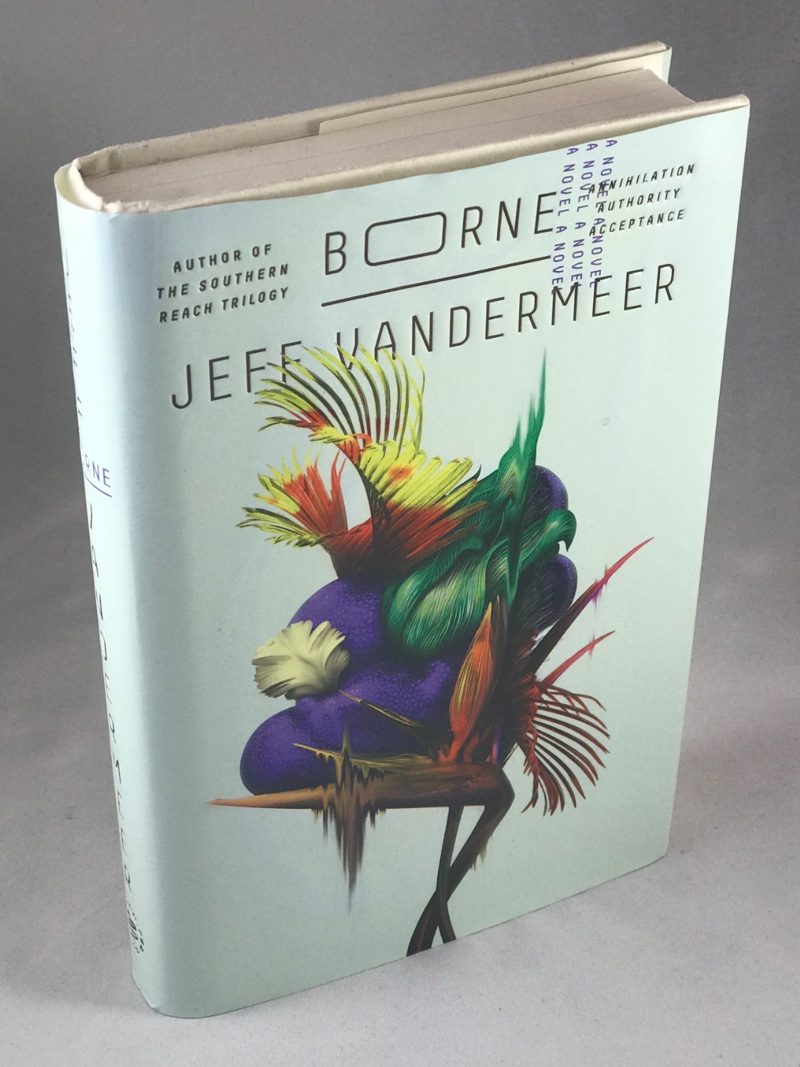
So, Jeff VanderMeer’s Borne (2017, 4th Estate) 18 and Annihilation, 19 Jo Walker and Julian Humphries have done his covers for several years, there’s some really good ones in there. Glenn O’Neill, who works at Penguin does Nick Hathaway’s covers. Chris Bentham designed William Gibson’s Agency (2020, Viking) – it’s like a big ‘A’, on the cover. 20 I think that’s fantastic.
SK I think it’s a really exciting time for science fiction, which has always had a little bit of an ebb and flow anyway. There are times when it’s super popular and times when it’s not really taken as ‘serious literature’. It’s been amazing to watch how the cover designs for sci-fi have continued to evolve alongside the genre itself, which I can’t help but feel is approaching or maybe even already in a new golden age.
It’s been wonderful to speak with you, Suzanne. Thanks for your time.